In mid-January this year, Google made a fairly big change to the way in which it displayed search results.
And everyone got very angry.
If you used the search giant on a desktop computer or laptop either on or after 14th January 2020, you’ll have been met with a considerably different view of search results.
A few weeks later, and after lots of public criticism from politicians, the press and regular consumers, Google decided to redesign its redesign. Again.
Referred to in the tech press as a ‘user-hostile design change’, Google’s new take on search results was immediately jarring when viewed on a bigger screen.
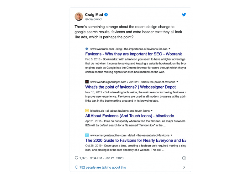
Suddenly, search results were displayed with a favicon, followed by the URL and then the rest of the preview text.
Writer Craig Mod accurately summed up the problem in a tweet at the time of the update:

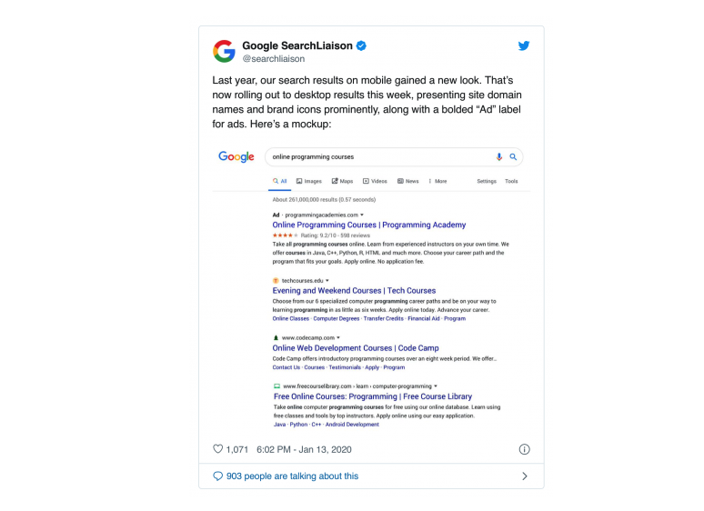
Mod’s point is justified; the new search results pages look suspiciously ad-like, and the presence of ads themselves is somewhat diluted, as can be seen in this tweet from Google:

The tiny ‘Ad’ label is easy to miss, thus making those ads somewhat easier to click by mistake.
And what do Ads make? Money for Google, of course.
Only Google knows the answer to the above, but there has long been plenty of suspicion surrounding their seeming desire to make Ads far less obvious in the results pages.
It’s a slightly unfair trick to pull on users of the search engine, but it’s a trick that will probably have made Google a fair bit more advertising revenue. Still, users aren’t daft, and nor is the tech press.
However, the sheer level of noise generated after the launch of the new-look pages wasn’t really centred on Ads themselves, it was simply how poorly designed the change was.
People complained of being unable to distinguish individual results and it’s true that the new look was anything but user-friendly.
The problem was actually easier to identify if you carried out the same search term on a mobile device. It was at that point Google’s design decision started to become clear; they had simply mirrored the way in which results were presented on mobiles, on the desktop.
This doesn’t work. Google results on smartphones are still pretty well designed. The presence of site favicons doesn’t detract from the overall experience and the Ads are still relatively easy to distinguish. Translating that look and feel to a bigger screen is just daft - no question.
Google seems to have admitted that this latest change to its search result pages was indeed an experiment, but one that went too far.
This does, however, highlight just how powerful Google is. They can change things on a whim and see what feedback they get. And they’re big enough to weather most storms if they get it wrong - including this one.
Unfortunately, the net rest of changes like this is a dip in search traffic for the owners of websites. That’s pretty unforgivable, but it’s a battle few people are going to attempt to have with Google; where on earth would that get you, after all?
What this episode illustrates, however, is that you cannot stand still and stagnate. What if Google had decided to keep the change, despite the flack they received? You’d have no choice but to go with it and ensure your website is up to date.
Thankfully, that didn’t happen here, but we all need to be vigilant and stay up-to-speed with Google’s evolution. Whatever it does, websites will need to follow, therefore stay tuned to our blog for the latest SEO tips and assistance that will help you stay ahead of the search engine curve. Or, at least, as close to it as possible!